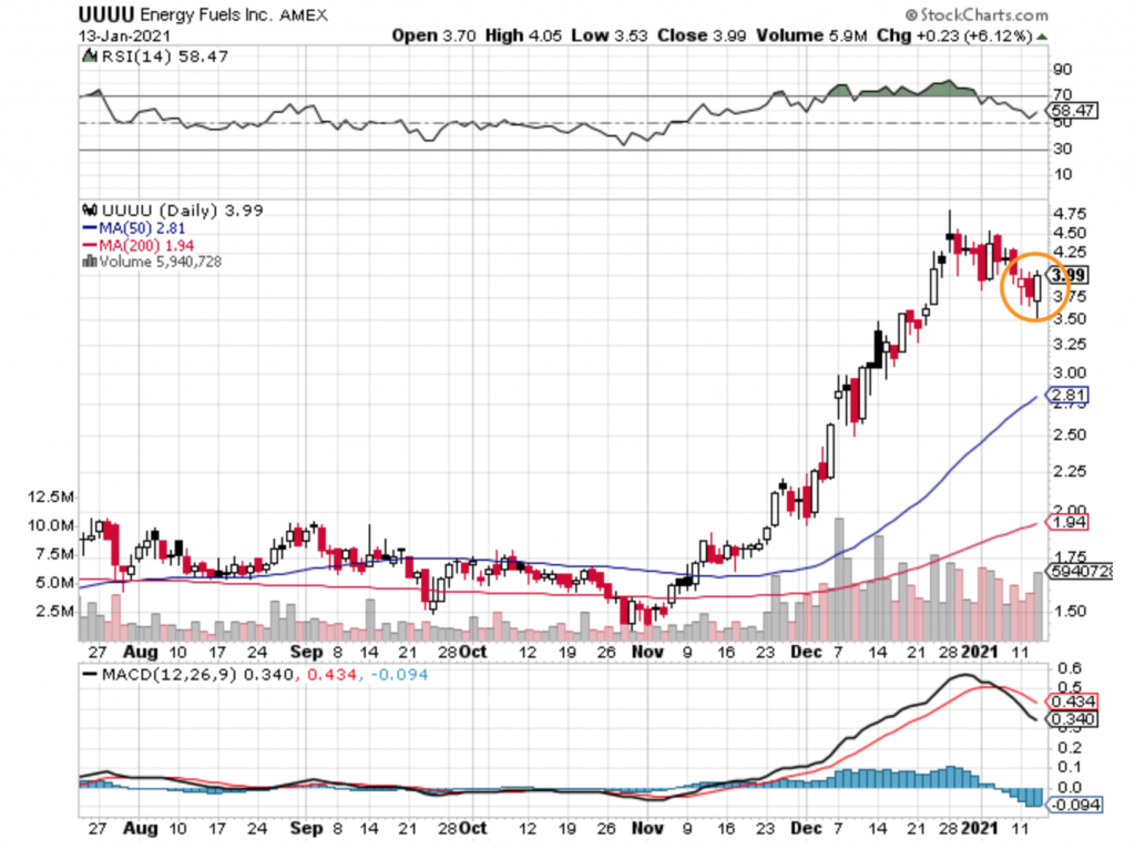
Thanks I think in part to its neighbor Ur-Energy ($URG) being up 20+% or some crazy amount Energy Fuels ($UUUU) printed a bullish engulfing candle today and that is a good sign:
We will see where things head tomorrow and if Energy Fuels can break out of this bull flag its in currently – time will tell.
Disclosure: We are long shares of Energy Fuels ($UUUU). We are also both long and short call options of Energy Fuels ($UUUU).
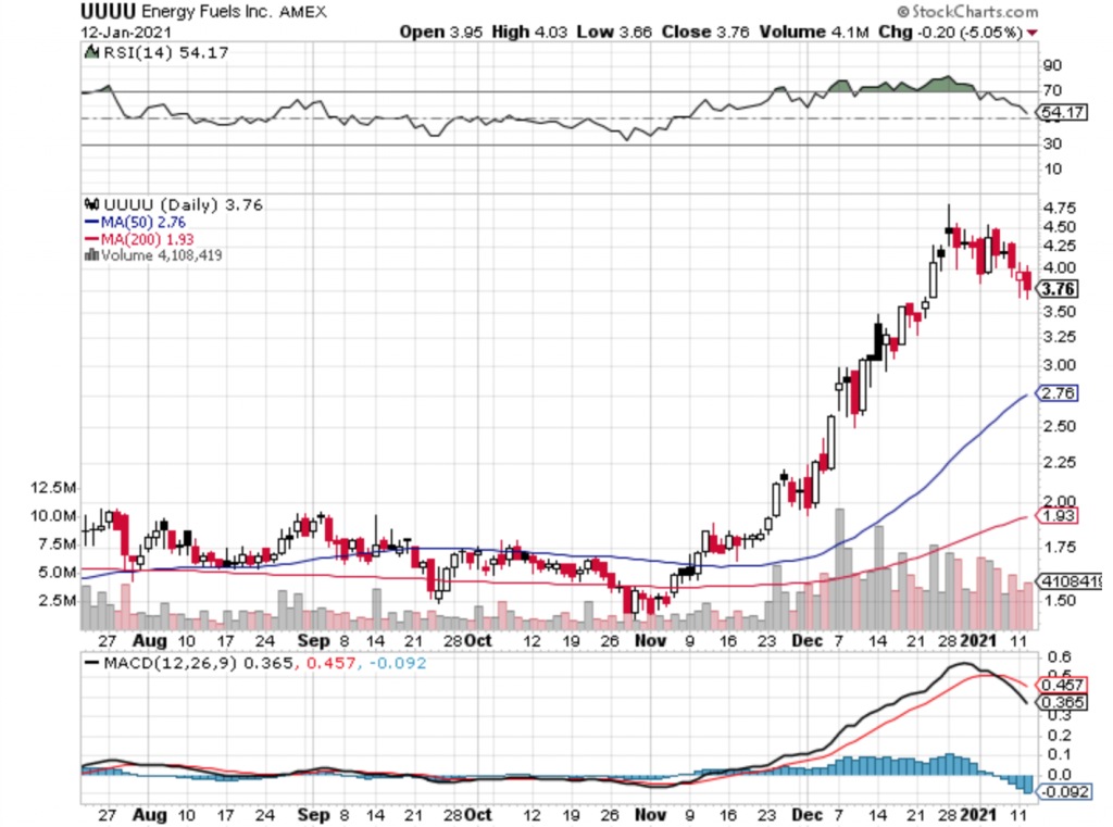
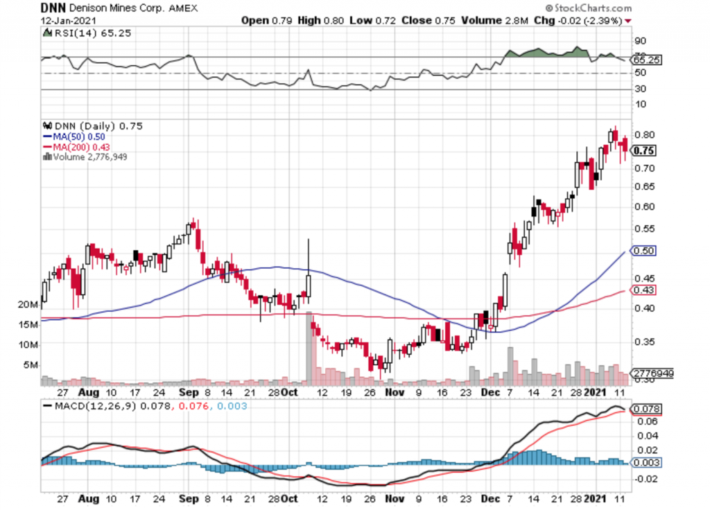
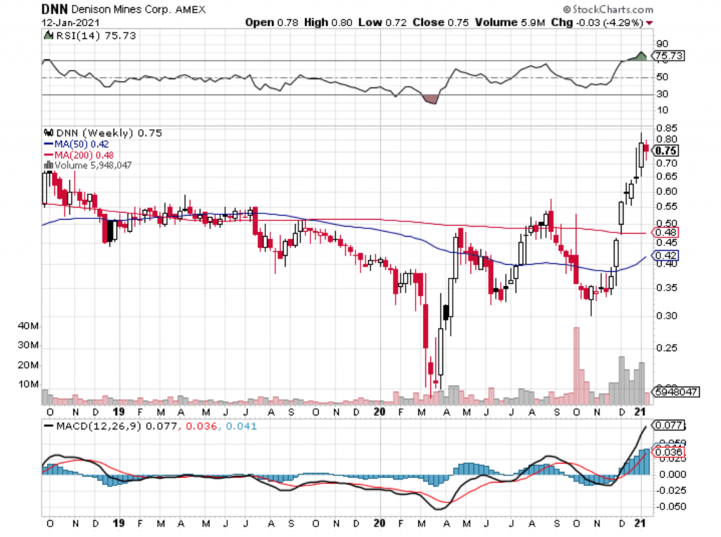
Uranium has been on a rocket ride since early November 2020 and we have enjoyed the run up. Here are a few daily charts of our favorite uranium plays Energy Fuels ($UUUU) and Denison Mines ($DNN) courtesy of StockCharts.com:
On the chart above notice how the MACD (Moving Average Convergence Divergence) black line has crossed below the red signal line. This is a bearish indicator for the Energy Fuels daily chart and could mean that a further correction is warranted and may take longer to play out.
In the case of Denison Mines ($DNN) above, the MACD line has not crossed over yet, but it is threatening to do so. Again, a potential bearish indicator for the daily chart and this could take longer to play out fully.
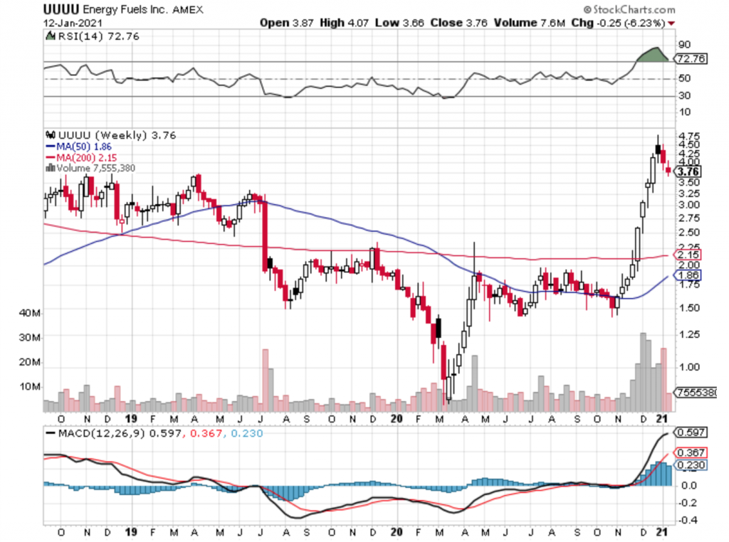
We feel like its important to take a look at the larger (macro) picture, so here are the weekly charts for Energy Fuels and Denison Mines:
Both of these weekly charts show a lot of strength and this correction may still be in its early stages. However for the long term we feel this correction is temporary and we are still very bullish on the uranium sector as a whole and believe we are still in the early innings of a longterm bull market.
Disclosure: We are long shares of Energy Fuels ($UUUU) and Denison Mines ($DNN). We are also both long and short call options of Energy Fuels ($UUUU) and Denison Mines ($DNN).
It was the Summer of 2004 – songs like Float On by Modest Mouse, Take Me Out by Franz Ferdinand and Mr. Brightside by The Killers were hitting the alternative rock scene. I was visiting my brother who lived in Huntington Beach with a few roommates. He invited me to go out surfing with them. I love to skateboard and snowboard, so I thought to myself “how hard can surfing be?”
As soon as I got out into the ocean I didn’t understand how they could catch waves so well – it seemed effortless for them, while I was getting punished by the surf. My timing was off – I was fighting the waves while they were using them to their advantage.
I found that the same was true for the first half of my investing life. I spent the first half of my investing life fighting the macro waves rather than using them to my advantage.
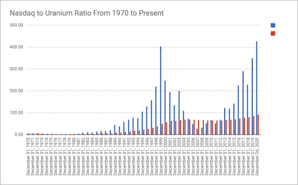
So, what are these macro waves? Well, there are many markets at play, however I have chosen two that interest me most, and happen to be somewhat inversely correlated – the Nasdaq (Growth and Tech stocks) and Commodities (Value stocks). These two major markets have moved counter to each other for the past few decades. For example, here is a graph that shows the ratio of the Nasdaq to the Uranium price from 1970 to the present. The blue bar is the yearly ratio of the Nasdaq to the Uranium price. The red bar is the moving average of that ratio year over year.
Notice how the ratio (blue bars) look like large waves. Just like in surfing, its much better to work with the waves than against them. For this particular chart, one would have done quite well to purchase shares of the Nasdaq Composite in 1980, hold on to those shares until 1999, then purchase shares in Uranium stocks, hold on to those shares until 2007, and then purchase shares of the Nasdaq Composite and hold on to them until present day (we would argue that now is a good time to purchase Uranium stocks again – which we are doing).
Another advantage of this macro ratio investing is that you have an indicator (the red moving average) that can assist you in determining when values are no longer historically distorted. Essentially, moving averages can help you know “when to sell.”